This case study documents an early-stage activation and retention intervention for a SaaS product, focused on reducing cognitive friction and improving expectation alignment before signup
Client
Year
Website

Challenge
Users experienced cognitive overload and insufficient clarity early in the page experience.
Prior to intervention, users struggled to quickly understand who the product was for, what specific problem it solved, and what action they were expected to take next. Information was presented in a fragmented hierarchy, requiring users to infer context by scrolling and interpreting multiple sections before reaching the primary call to action. As a result, bounce rate was high, average time on page was low, scroll depth to the CTA section was inconsistent, and the page view → signup rate remained below expectations. Many users exited before reaching a point of informed decision-making.

What We Did
The page was restructured as a single, linear decision environment aligned to user understanding.
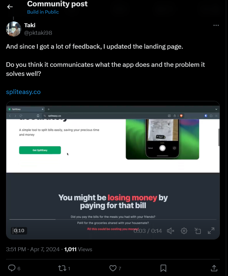
The landing page was rebuilt around a clear, sequential flow designed to support decision-making rather than exploration. Low-signal and redundant sections were removed, and the core value explanation was introduced earlier in the page to establish relevance upfront. The narrative was organized to answer fundamental user questions in order, reducing the cognitive effort required to interpret the product.
Call-to-action placement was deliberately positioned after clarity was established, ensuring that users encountered signup prompts only once expectations had been sufficiently aligned. The goal was not to persuade more users, but to reduce friction for the right users.
Result
Clearer understanding led to stronger early commitment and more aligned signups.
Following the restructuring, users demonstrated improved engagement patterns consistent with stronger expectation alignment. Average time on page increased, indicating deeper content consumption, while scroll depth to the primary CTA section improved as users progressed further through the page.
The page view → signup rate increased relative to baseline, reflecting higher willingness to commit once clarity was established.
Qualitative feedback supported these shifts, with users demonstrating a clearer understanding of the product’s purpose at the point of signup. Overall, the intervention resulted in signups that were better aligned with the product’s intended use, strengthening early-stage retention signals without relying on increased persuasion or traffic.
Expectation alignment in practice

Expectation alignment in practice