By auditing, testing, and redesigning SpliTeasy’s landing pages, we doubled conversions in just 2 months. Bounce rates dropped by 28%, trial sign-ups increased by 35%, and the client now has a scalable blueprint for continuous optimization.
Spliteasy is a SaaS platform that helps people split bills instantly by scanning receipts or bills through their camera. Despite offering a unique and highly useful feature, their landing pages were underperforming in converting visitors into active users.
The client wanted to:
Before our intervention, Spliteasy’s landing pages were mostly static and did not highlight the ease and uniqueness of their bill-splitting feature.
Here’s how we approached the project:
Comprehensive Audit: Analyzed existing landing pages to identify friction points, unclear messaging, and weak CTAs.
A/B Testing: Tested multiple variants of pages, emphasizing the camera-scan feature to make the value proposition clear.
Conversion-Driven Copywriting: Rewrote headlines, subheadings, and microcopy to clearly communicate how users can effortlessly split bills.
Design & UX Optimization: Improved layout, visual hierarchy, and illustrations to showcase the feature and reduce bounce rates.
Continuous Monitoring: Tracked user behavior, heatmaps, and conversion funnels to refine pages for better performance.
We continue optimizing landing pages and onboarding flows, emphasizing simplicity and the camera-scan functionality. The focus is on converting trial users into active, long-term users.
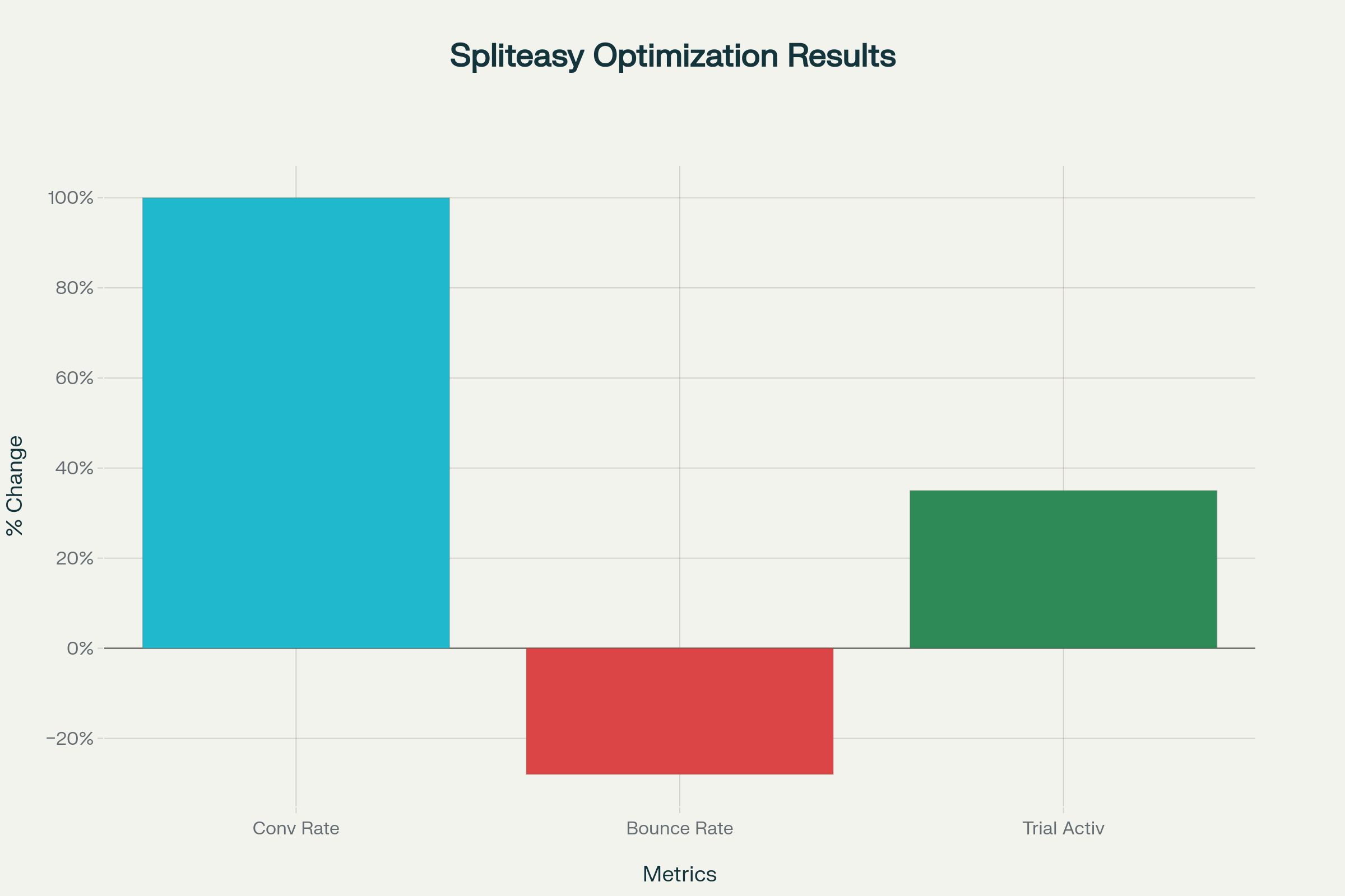
Conversion rate doubled on primary landing pages within 2 months
Bounce rate decreased by 28%
Trial activations increased by 35%, driven by highlighting the camera-based bill-splitting feature
Users better understood the platform’s core value, resulting in higher engagement